Clark

Clark is an automated insurance advisor, allowing clients to improve their insurance coverage in a matter of minutes.

Responsabilities

UI/UX Design, Iconography, Typography, Interaction Design, Brand development.

Softwares used

Sketch, Adobe Photoshop, Adobe Illustrator, Adobe After Effects, Miro.

The process

The task was to design and rebrand the online web presence, with a new contemporary style. The website had to work with less visual elements as possible and a monoschrome color palette.

The solution

Clark’s main color is blue, a color that delivers protection, trust. The rest of the monochrome palette is built around shades of this colors to create a low contrast environment. The only recurrent visual elements are a circle, to symbolise protection and a hand, to symbolise the users’ power. The iconography is black to deliver boldness and assertiveness.

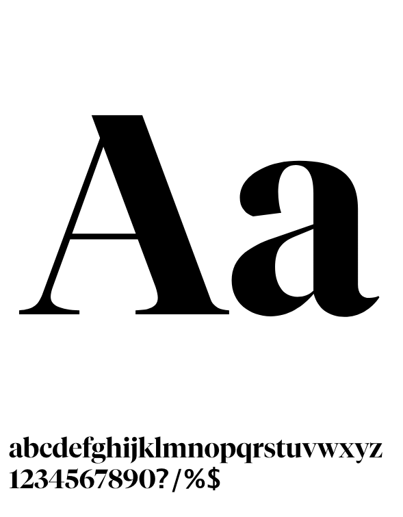
The serif typography adds a conservative classy elements to the overall cold and minimalistic design language, giving contrast to the overall design.

The icons are designed to be casual and bold. The curved lines and the rounded corners deliver a friendly feeling while the bold lines and solid colors show boldness.

Tiempo font family is used for titles to create a difference between title and content. The headlines get a stronger impact given by an uncommon choice in the digital world, such as the use of serif fonts.

The font family works well also as decorative graphical elements, to highlight parts of the content.