EWE Netz

EWE Netz is an energie provider operating in North-West Germany, Brandenburg and Mecklenburg-Vorpommern.

It works to be one of the main facilitator to the transition to green energy.

Responsabilities

Art Direction, UI/UX Design, Interaction Design, iconography, design system.

Softwares used

Sketch, Adobe Illustrator, Miro.

The process

The task was to design the whole portal from scratch, to bring the users into the digital world.

The client wanted to create a product that was appealing to the young generations, yet usable by the current clients, which belonged to an older generation.

The solution

The design language we decided to follow was very clean and simple.

Once the user journeys were wireframed, they were tested with real EWE Netz clients, in order to check if the current target was responding well to the new look and feel.

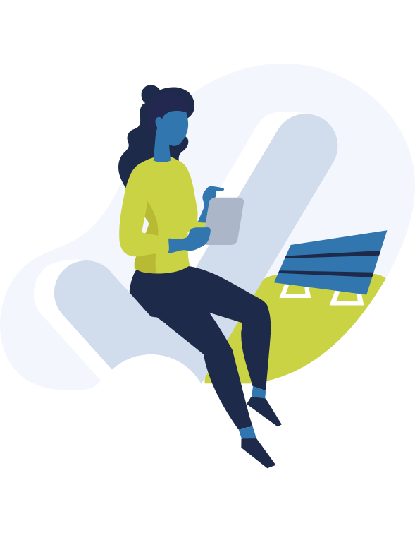
The illustrations, which gave an overall contemporary direction to the app, were used to help and introduce the topic to the user, rather than distract.

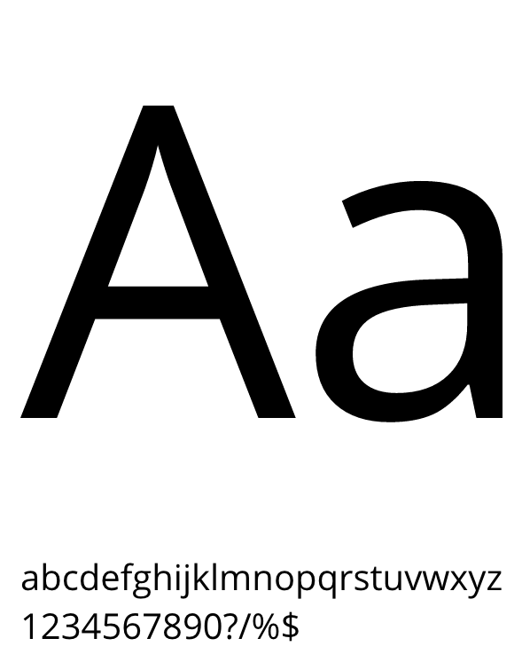
The colour palette, the typography and the iconography were carefully choosen to create a fresh and elegant look.

The users can be above fifty years old, therefore the icons are clean and simple, immediately understandable to people who are not digital friendly.

The illustrations are created to drive the user through the process.

The curved lines creates feelings of calm and serenity.

Open Sans is an extremely well readable font family, ideal for this target users.

Moreover, the sizes and the line height are thought to be big enough to accomodate any readability issues.